TIQ 2.0 Automated time tracking Vue.js application
It’s been a while since I’ve written a decent blog post about things I’ve worked on. Well, that’s because I’ve been busy working on something new :-)
TIQ is a startup focused on automated time tracking for the legal sector - but it didn’t start out that way. Initially, we had built a complete project management solution with automated time tracking as one of the features. We decided to focus on automated time tracking and later, we decided to do this just for the legal sector. Of course, these pivots have consequences for the product and we’ve adapted the product along the way.
It was time to rebuild TIQ from scratch with one goal in mind: make it the most practical time tracking solution for the legal sector. In this blog post, I will share a bit about the development process and highlight the main improvements we have made to TIQ.
What is TIQ?
If you want to know more about TIQ in general, please read my earlier blog post about TIQ.
Goals & improvements
To put it simply, we wanted to improve TIQ for the main target audience - lawyers - by making it as fast as possible for them, both technically and in terms of usability. This means:
- Utilise the latest technological advantages
- Remove anything from the application that isn’t strictly necessary
- Fast access to core functionality
- Desktop first
Based on these goals, the key improvements in version 2.0 are:
- 10x Faster loading times & response times than our previous application.
- More focused user interface: clear separation of information per day with the most important information and functionality for bookings always in sight. Information can be filtered based on user preference.
- Faster workflow: easy menu structure and full keyboard navigation support, without compromising on functionality.
And of course, some images of the end-result:
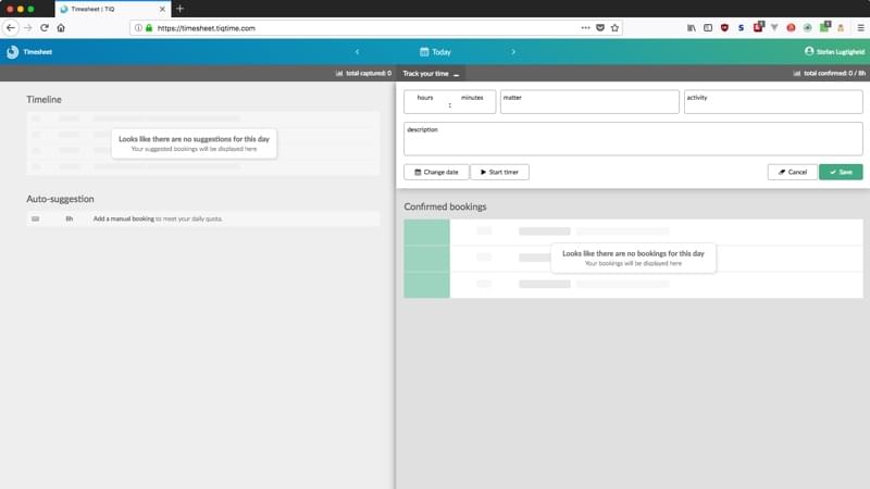
The TIQ timesheet in empty state. Even in a blank state it allows you to quickly add an entry to meet your daily quota.
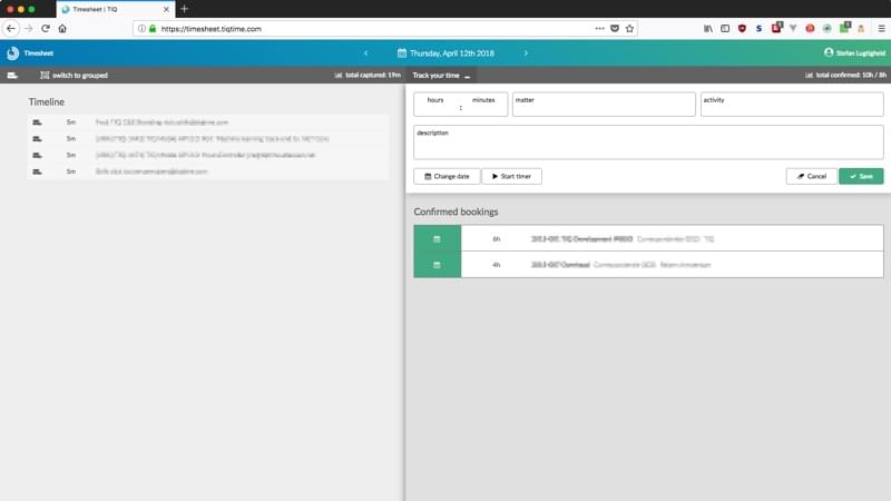
The TIQ timesheet in a filled state, with confirmed entries on the right and suggested entries on the left.
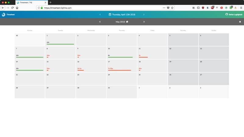
The calendar view is a month overview and acts as a day/week/month navigation.
The process
Goal 1: Utilise the latest technological advantages
.NET Core - we have been using .NET MVC and recently switched to .NET Core for its back-end modularity. As a front-end developer and not necessarily an enthusiast of Microsoft web technology, I am very happy that .NET Core is open source and usable on the platforms I use (Linux + Mac OS).
Vue.js - coming from Angular.js 1, the rest of the team was a bit sceptical about using Vue.js, this new, hip framework without a tech giant supporting it. So we decided to do some A/B tests and created identical applications in the latest Angular and Vue.js frameworks. With our .NET Core setup, we found that Vue.js was about 2x as fast as Angular. Today, the full development team is happy with the transition to Vue.js as it has drastically reduced the amount of Javascript we write.
Conclusion: with these technical changes and by rebuilding everything from the ground up, our average request is about 10x faster than the previous version (and with less code).
Goal 2: Remove anything from the application that isn’t strictly necessary
Over the years, we have added a lot of functionality to TIQ that enriched it, but also made it more complicated.
From a designer’s point of view, less is more and removing functionality would be a bliss. But realistically, we have customers who pay to use that functionality. So the challenge was to move functionality instead of removing it. The key turned out to be to separate the screens per month and switching to a 2-column layout.
Conclusion: by focusing on the typical use cases, we were able to prioritise the functionality that is used in 80% of all use cases. We put this at the basis of our redesign and came up with a totally new user interface that also feels more natural than before.
Goal 3: Fast access to core functionality
If you use TIQ daily, it mostly goes like this:
- You log in
- You check out the overview TIQ made for you
- You confirm, edit or delete items from the overview
- You continue working on something else
We analysed the number of clicks needed to get to each of the functions that are used above and found that by structuring the user interface differently, all of this could be done without entering menus. Now everything can be done with a single click or keystroke, which makes it a lot more pleasant to use.
Conclusion: The design of the user interface has been improved both functionally and visually by carefully studying actual user behavior. Focusing on the core functionality and hiding the optional functionality, makes the user interface less cluttered. Furthermore, this reduces the cognitive load and draws the eye to the most important parts.
Goal 4: Desktop first
‘Mobile first’ has been a popular paradigm in web development for some time now. In short, this means you design everything for the smallest screen possible and then design the larger desktop version. This is done because it’s typically easier to design for a larger screen.
At TIQ, we designed our first version as a ‘mobile first’ application. However, for TIQ 2.0 we decided to put the desktop first. The reason for this is simple: our metrics have shown that our customers use the web application on their desktop PC and the TIQ mobile application on their mobile phone. In other words: users rarely see the mobile version of the web application we put so much effort in!
By separating the mobile and desktop experiences, we are able to focus on what each medium does best: making a more ‘tangible’ user interface on mobile (e.g. swiping) and a more information-focused interface on desktop, also utilising mouse interactions that have no alternative on mobile (e.g. hover).
Conclusion: although moving away from the ‘mobile first’ paradigm feels a bit like stepping back in time, it can really improve the user experience and developer experience. Logically, it makes sense to fine-tune the interface for each medium and utilise its core strengths, instead of trying to even everything out. In the end it comes down to supporting natural user behavior over making a technical masterpiece.
My responsibilities
At TIQ, we work with a team of 3 developers (yours truly for front-end work and 2 .NET Core back-end developers). My responsibilities for this project were:
- Product strategy: Determine the practical and technical features based on customer input and the required software architecture to support this.
- Javascript development lead: From our team, I’ve spent the most hours programming in plain Javascript. This means I’ve set up the main architecture for the Vue.js application and have worked on the tricky parts.
- Front-end development: I’ve done all graphic design, UI/UX development and front-end development (HTML, CSS)
More information
- TIQ web application
- TIQ iOS application
- TIQ Android application
- Image courtesy: header image and product images by TIQ